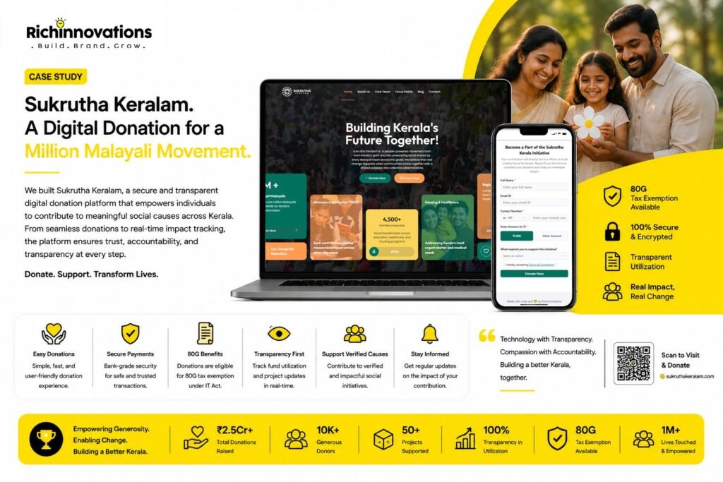
1. We split the architecture to suit each job. The content site and the donation platform were built as two separate applications on two subdomains, connected by clear navigation. WordPress handles storytelling, where flexible content management is the priority. The custom React and Node application handles giving, where speed, control and reliability matter more than editorial flexibility. Neither compromises for the other.
2. We built the donation platform in React and Node for control over the critical path. Rather than bolting a plugin onto WordPress, the donation flow was built as a purpose-made application. That gave us full control over form behaviour, validation, performance and the payment journey — the sequence where a fundraising platform either succeeds or quietly loses money.
3. We reduced the donation form to its essentials. The flow asks only for what is genuinely needed: full name, contact number, amount and email, with a preset ₹1,000 that can be overridden by any other amount in a single tap. One short optional question captures what inspired the donor to contribute — useful insight for the campaign, and never a barrier to completing the gift.
4. We built the WordPress site for the organisation to run themselves. Programmes, impact areas, blog posts, team profiles and page content are all managed by the Sukrutha Keralam team directly. The movement publishes at its own pace, and the site reflects current activity without a development dependency.
5. We made the evidence the centrepiece. The Kerala Development Crisis Dashboard organises sourced statistics into navigable sections — overview, healthcare, housing, skills and jobs, women, and the drug crisis — so a visitor can move from a headline figure to the detail behind it at their own pace. Rather than asking donors to take the need on faith, the site shows them the gap, with sources cited.
6. We designed the whole site around a single conversion path. Every section terminates in the same action. Donate prompts appear in the hero, alongside the values, at the close of the data dashboard, within programme listings and in the calls to action between sections — always routing to the same optimised donation application. A visitor persuaded at any point can act immediately, without navigating for it.
7. We built trust into the structure of the site. Registered trust status, the four stated values of transparency, sustainability, inclusion and responsibility, named mentors and core team, a clear four-step explanation of how contributions are used, and published Terms & Conditions and Privacy Policy on the donation platform. Credibility is distributed across the experience rather than confined to an About page.
8. We optimised delivery for a global mobile audience. Modern image formats, responsive sizing and delivery optimisation keep pages fast on mobile connections and modest devices — because a donor who does not wait for a page to load never sees the case for supporting it.
9. We published the legal and privacy framework alongside the ask. Terms and privacy documentation sit directly within the donation platform, with explicit acceptance required before a contribution is submitted. For a public fundraising movement, that transparency is part of the offering rather than compliance overhead.